


Style your form
Quick Settings are the fastest way to make an upload form feel like your brand. In a few clicks you set the form's mode, corner style, color, and font, then add your logo below. All of the Quick Settings are available on every plan.
You need an upload form to style. If you have not made one yet, start with Create your first upload form.
Open the Style panel
- On the Upload Forms page, open your form.
- In the Build tab's left menu, click Style. Quick Settings is the first section in the panel, with the Logo section directly below it.
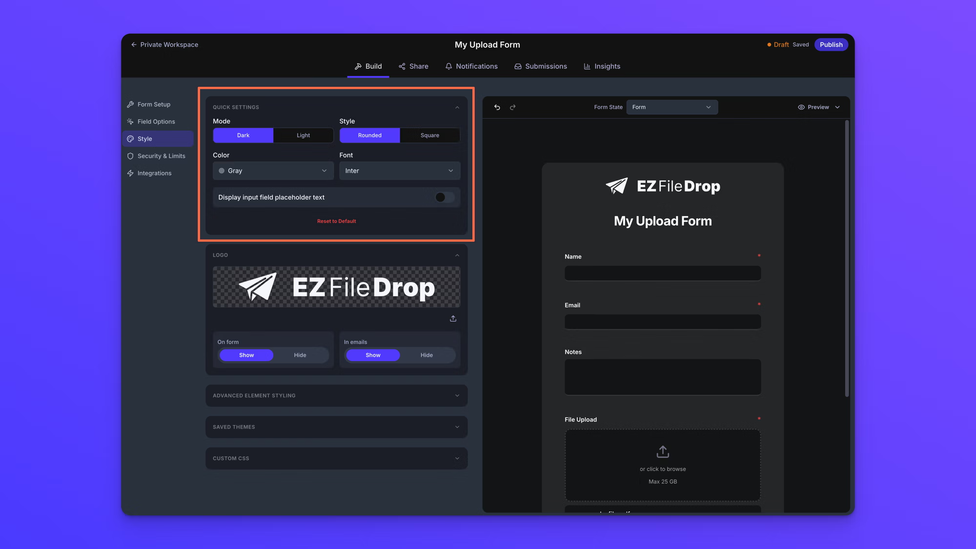
The form canvas beside the panel updates as you change each setting, so you can see every choice on your form as you make it.
Choose a mode and corner style
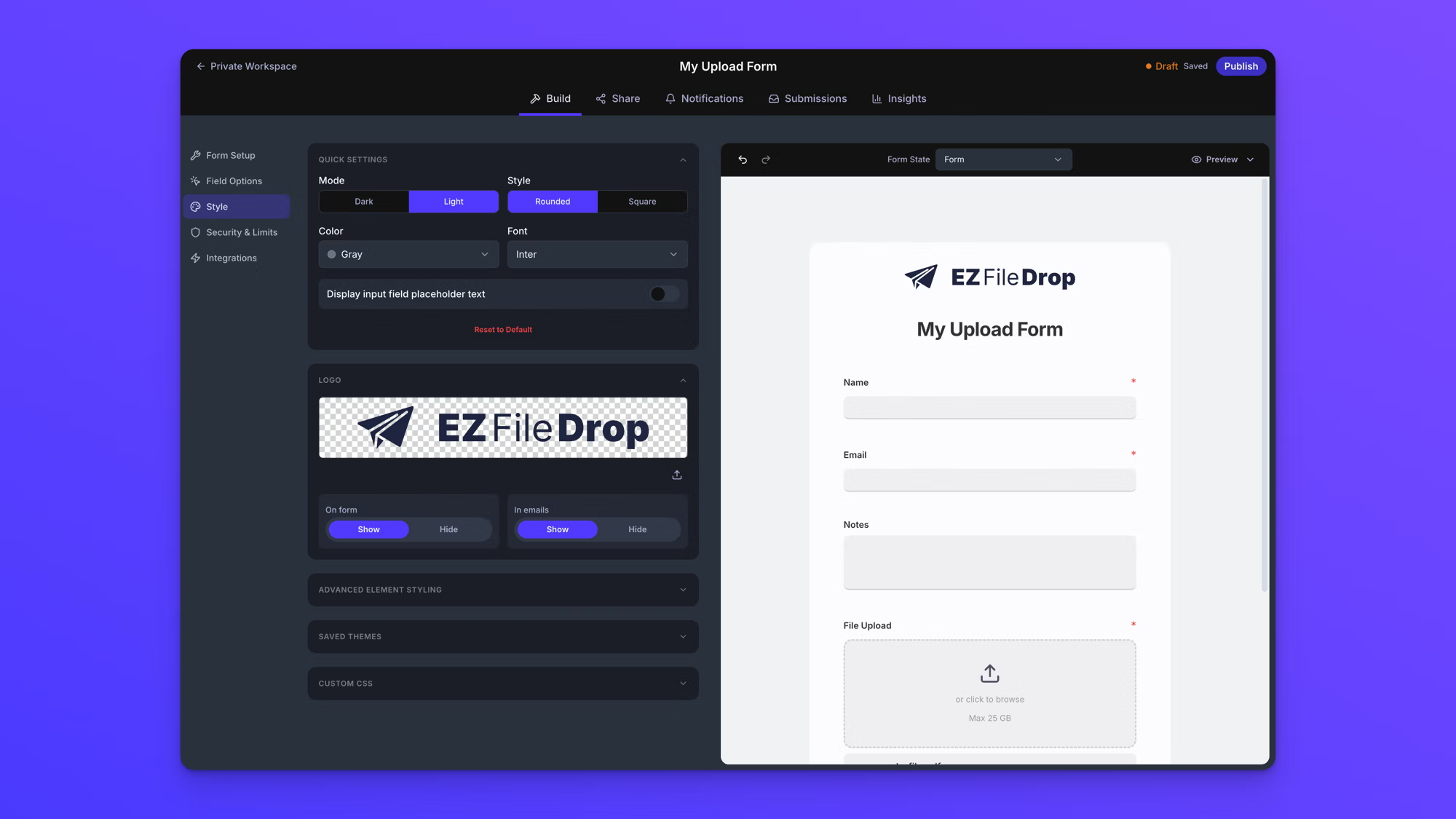
- Under Mode, choose Dark or Light to set the form's overall look.
- Under Style, choose Rounded or Square to set the corner shape of the form and all of its field inputs.
Pick a color
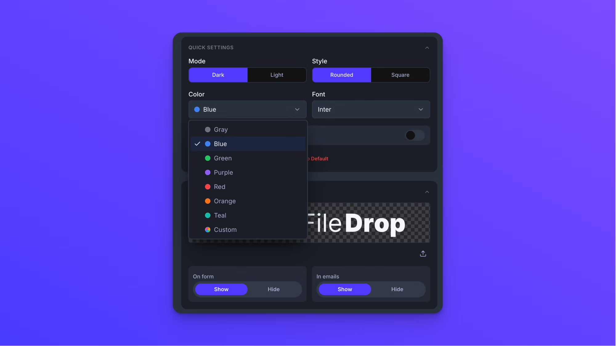
Under Color, choose the color the form is tinted with: Gray, Blue, Green, Purple, Red, Orange, or Teal. The color works with either mode. A dark form stays dark and a light form stays light, and every color is applied at a readable level, so the form feels like one of your brand colors while the text stays easy to read.
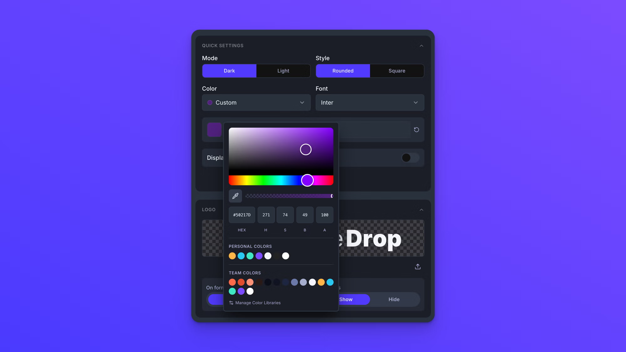
To tint the form with one of your own brand colors, choose Custom. A color picker opens where you can enter a hex value, pick a color with the eyedropper, or adjust it directly. The custom color is still applied as a tint at the same readable levels as the presets, not as an exact match. To set exact colors on individual parts of the form, use the Advanced Element Styling section; see Advanced form styling. If you have added colors to your color libraries, they appear at the bottom of the color picker; see Create and manage color libraries.
Choose a font
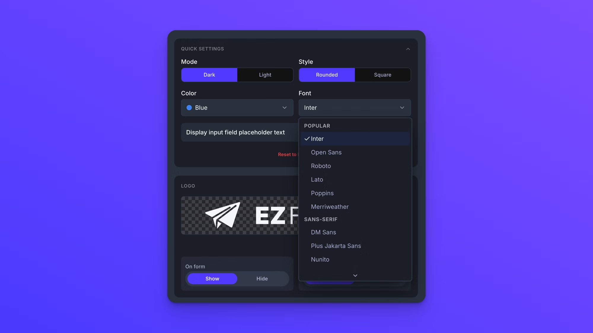
Under Font, choose the typeface the form uses. There are 46 of the most popular Google fonts to choose from, grouped in the dropdown with popular choices listed first.
Show placeholder text
The Display input field placeholder text toggle shows placeholder text inside each of the form's input fields. It is off by default.
Reset your styling
Reset to Default at the bottom of Quick Settings returns the form to the default styling. It resets everything, not just the Quick Settings, so anything set in Advanced Element Styling is cleared too. A "Reset to Default?" dialog asks you to confirm first. To reset one element rather than the whole form, use the Reset to Default inside that element's settings; see Advanced form styling.
Add your logo
The Logo section sits directly below Quick Settings. Every form includes the EZ File Drop logo, and uploading your own logo in its place is available on the Business and Premium plans.
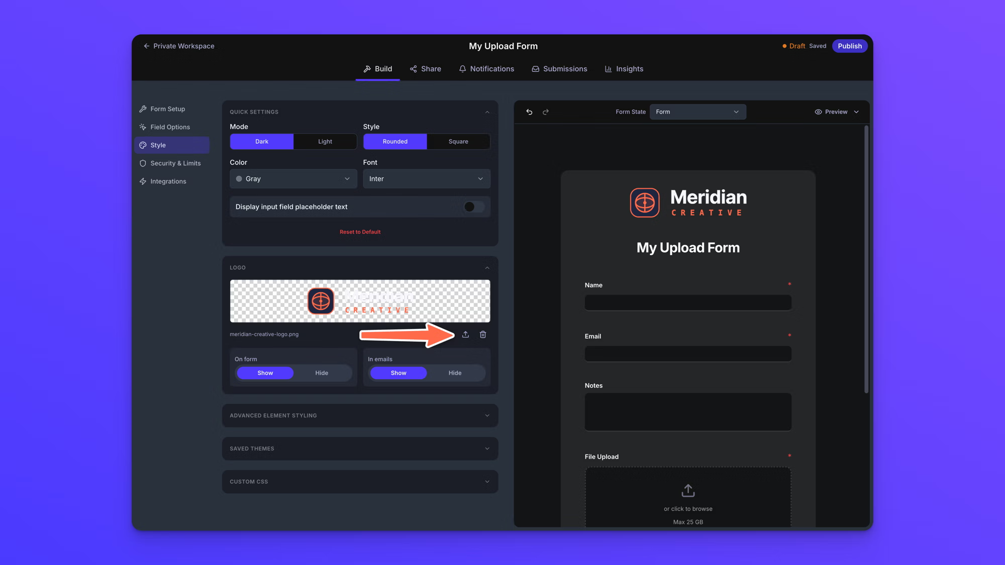
- In the Logo section, click the upload icon.
- Upload your logo file.
Once your own logo is in place, click the pencil icon to replace it or the trash icon to remove it. Two toggles below control where the logo shows. On form shows or hides it on the form itself, and In emails shows or hides it on the email notifications the form sends. Hiding it on the form is common for embedded forms, where the page around the form already carries your branding. Both toggles are available on the Business and Premium plans, alongside the logo upload.
Your logo appears on the form, on the success screen, on the password prompt, on the screens shown when a form is closed, and in the email notifications the form sends. Because the two toggles are separate, you can hide it on the form and keep it on your emails. Upload one even if you plan to hide it on the form itself.
Check the success screen
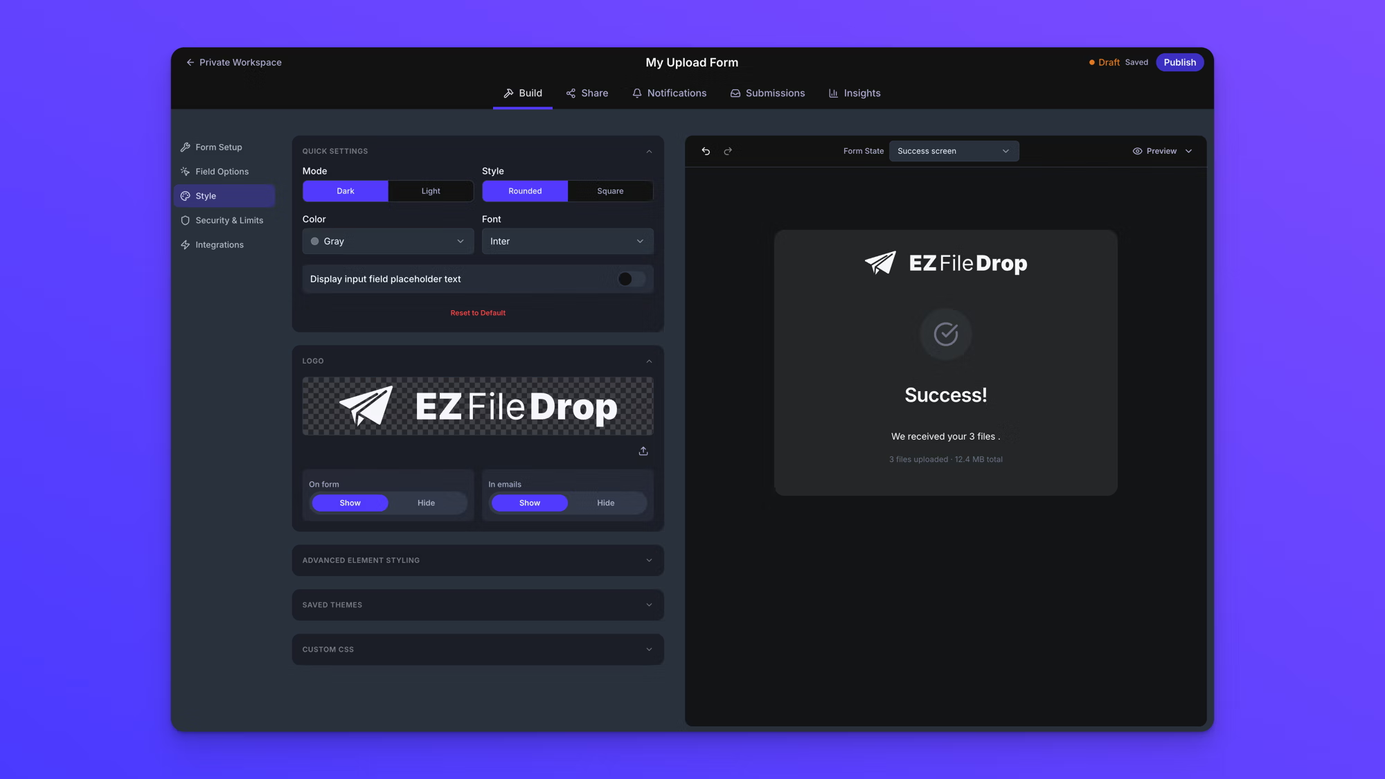
Quick Settings style the whole form, not just the fields in front of you. To see this, use the Form State selector above the form canvas and choose Success screen. The success screen an uploader sees after submitting carries the same mode, color, font, and logo you just set. The success screen's message is edited in the form's Form Setup section. Every other form state can be previewed the same way; see See your form's states.
Publish your changes
Style changes are saved automatically, but uploaders do not see them until you publish. A Live form keeps showing its last published styling until you click Publish changes in the top right.
Quick Settings style the form as a whole. To style individual parts of the form, like the submit button or the File Upload field, use the rest of the Style panel, covered in Advanced form styling.