


Advanced form styling
Quick Settings style an upload form as a whole. Advanced Element Styling styles the individual parts: the page behind the form, the form card, each kind of field, the submit button, and the screens uploaders see after they submit or when something goes wrong.
Advanced Element Styling, Custom CSS, and Saved Themes are available on the Business and Premium plans.
Both sections sit in the Style panel of the Build tab, below Quick Settings and Logo. For Quick Settings and the logo, see Style your form.
Select an element to style
- On the Upload Forms page, open your form.
- In the left menu, click Style.
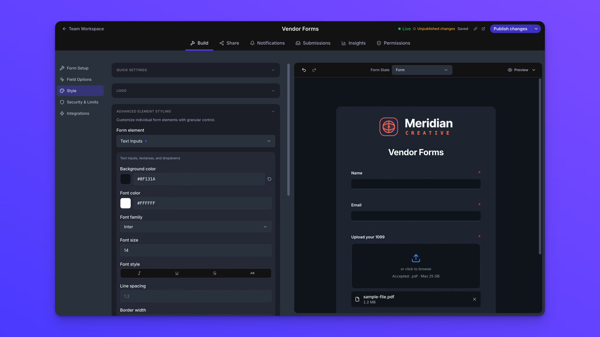
- Click any part of the form on the form canvas.
The panel on the left switches to that element's settings.
Clicking selects an element for styling only while Style is open. If Field Options is open instead, clicking a field opens that field's properties rather than its styling. If you get the wrong panel, check which item is highlighted in the left menu.
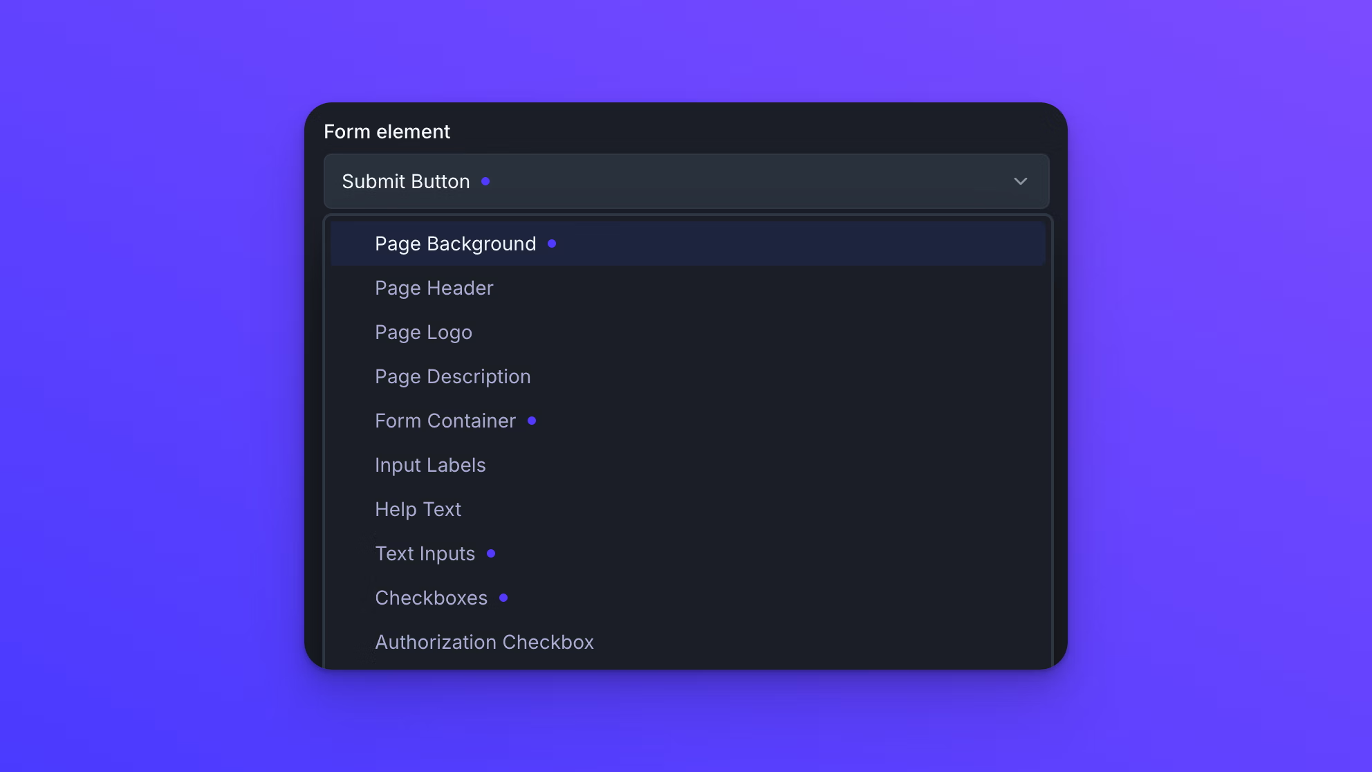
You can also pick an element from the Form element dropdown at the top of Advanced Element Styling. The dropdown lists every element, including ones that are not on your form or not visible in its current state, so some elements can only be reached this way.
What you can change
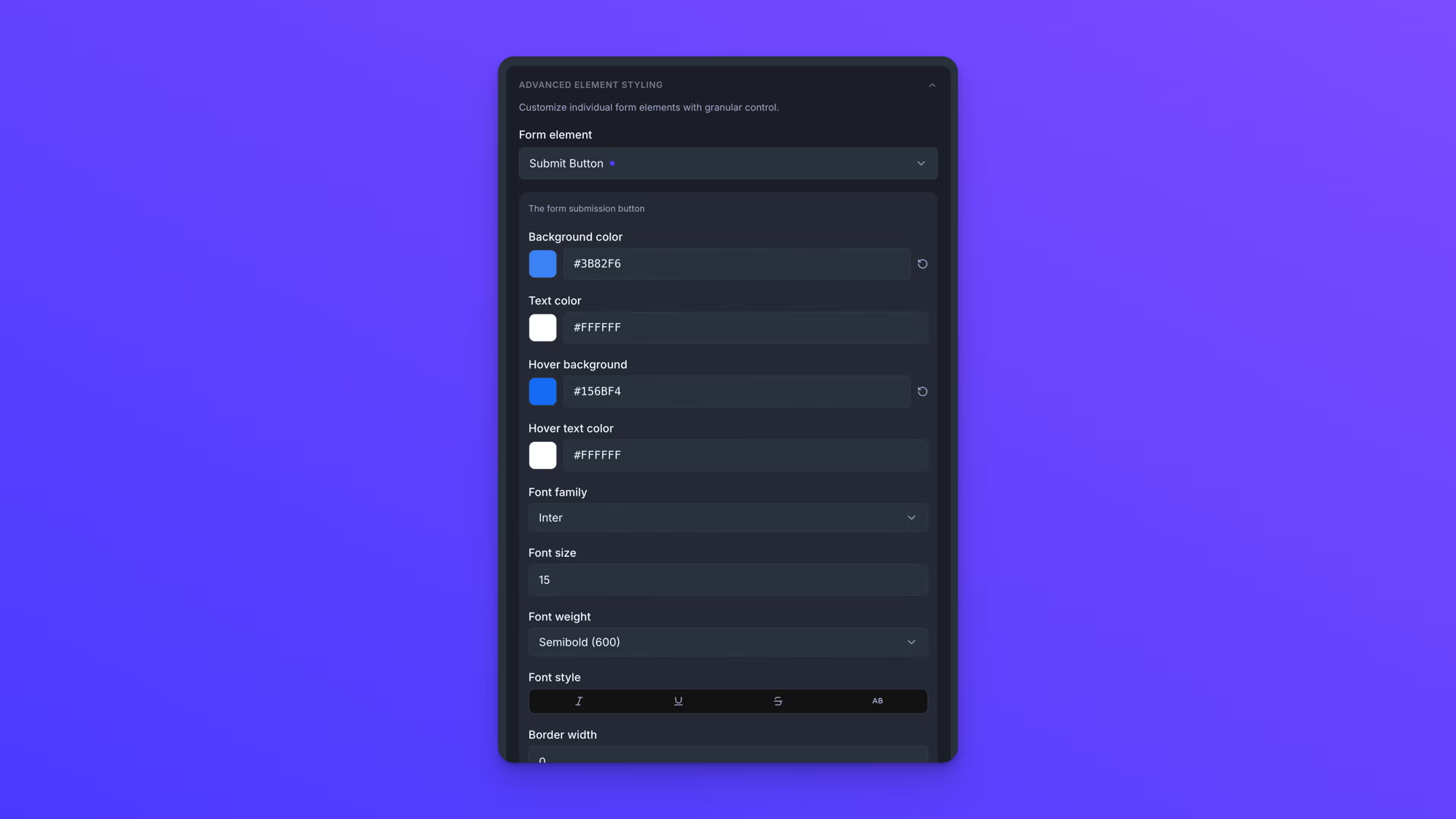
The settings that appear depend on the element you selected. Divider Block has a few. Submit Button has fifteen. Most of them fall into the same groups.
Typography: Font family, Font size, Font weight, Font style, Line spacing, and Alignment. Font style has four toggles: italic, underline, strikethrough, and AB, which sets the text in all caps.
Color: Background color and Text color or Font color on most elements, plus Accent color, Icon color, Label color, Title color, Description color, and Border color where the element has those parts. Every color takes a hex value or a swatch from the picker. Submit Button also has Hover background and Hover text color.
Borders and corners: Border width, Border style, and Corner radius.
Size and spacing: Padding on most elements, and Spacing with separate Top, Right, Bottom, and Left values on the page elements. Some elements have a size setting of their own, such as Max width on Form Container, Logo width on Page Logo, Icon size on Success State, and Width on Submit Button.
Placement: Page placement moves Form Title, Page Logo, and Description inside or outside the form card. Label position puts input labels Above or Inline with their fields.
A few settings belong to one element only. Required indicator under Input Labels sets how required fields are marked. Show upload icon under File Upload turns the icon in the upload area on or off. Line color and Line style under Divider Block set the look of the line, and Description font size under Authorization Checkbox sizes the text beside the checkbox.
Elements you can style
The Form element dropdown lists every part of a form that can be styled. They appear there as one continuous list, and are grouped below by the part of the form they belong to.
Page and container: Page Background, Form Title, Page Logo, Description, Form Container.
Fields and labels: Input Labels, Help Text, Text Inputs, Checkboxes, Authorization Checkbox, Multiple Choice.
File upload: File Upload, Files List, File Count Badge.
Submit: Submit Button.
Layout blocks: Heading 1 Block, Heading 2 Block, Title Block, Text Block, Divider Block.
Form states: Success State, Blocked State, Password Required State, Password Error State.
Validation errors: Text Inputs (Error), Input Labels (Error), Help Text (Error), File Upload (Error), Checkboxes (Error), Authorization Checkbox (Error), Multiple Choice (Error), Submit Button (Error).
One element can cover several field types. Text Inputs styles text inputs, text areas, and dropdowns together, so Short Text, Long Text, and Dropdown fields all take their styling from it.
Style the states uploaders see
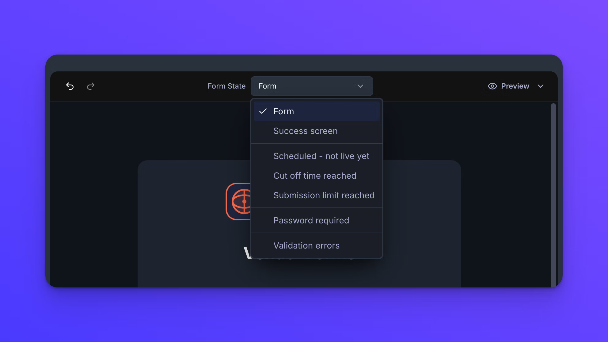
Some elements only appear when a form is in a particular state. Success State is the confirmation screen after a submission. Blocked State is what uploaders see when a form has stopped accepting submissions, either because its cut off time has passed or because it reached its submission limit. Password Required State and Password Error State belong to password-protected forms. The eight elements ending in (Error) style fields when validation fails.
To see what you are styling, use the Form State selector above the form canvas to switch to that state. Clicking an element in it selects that element the same way clicking on the form does. For all seven states, read See your form's states.
Keep track of what you have changed
A purple dot next to an element's name in the Form element dropdown means that element has at least one custom value. Elements without a dot are still on their defaults, so the dots show at a glance everything you have styled.
Reset to Default at the bottom of an element's settings returns that element to its default styling. It affects only the element you have selected, and it appears only once that element has something to reset. There is no confirmation step, but Undo reverses it.
Quick Settings has a Reset to Default of its own, and that one clears the styling on the whole form, including everything set here. It does ask you to confirm first.
Quick Settings override element styling
Setting Mode, Style, or Color in Quick Settings overrides changes you have already made in Advanced Element Styling. Undo, at the left of the strip above the form canvas, puts them back.
Font is the exception. It changes the font on every element that has one and leaves the rest of each element's styling alone.
Work from the top of the panel down. Set Mode, Style, Color, and Font in Quick Settings first, then use Advanced Element Styling for the parts you want to look different.
Custom CSS
The Custom CSS section at the bottom of the Style panel takes CSS that applies to the whole page your form is published on, not just the form itself. .ez-form-card is the one stable class the app provides, and it is on the form card and on the cards for the success, blocked, and password states. Everything else on the page uses utility classes that can change, so they are not safe to target.
Two things to know before writing any. Advanced Element Styling is applied to each element directly, and that beats a stylesheet, so a rule that collides with an element setting needs !important to take effect. And custom CSS does not render on the form canvas, so click Preview to see it.
This is for people who already write CSS and want control beyond what the settings panels expose. Everything described on this page is available without it.
Save your styling as a theme
When a form looks the way you want, you do not have to rebuild that styling on the next one. Click Save Current as Theme in the Saved Themes section to store the form's current styling under a name.
The theme is then available to apply to any other form you build. Themes are managed outside the form, where you can rename, update, delete, and share them with your team. See Create and manage themes.
Behavior notes
- Style changes are saved automatically a moment after you make them, and the indicator at the top of the form reads "Saving…" and then "Saved". Saving is not publishing. A Live form keeps showing its last published version until you click Publish changes in the top right.
- The Form element dropdown includes elements for parts a form may not have yet. Styling one has no effect until the form includes that field, block, or state.