

See your form's states
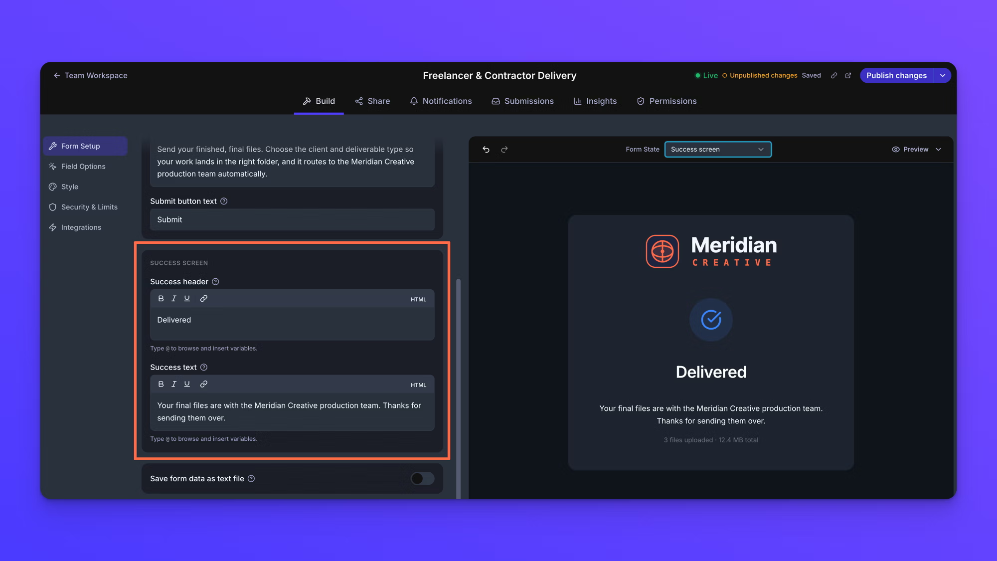
The Form State selector above the form canvas switches it between the screens an uploader can land on: the form itself, the success screen, and the screens a form shows when it is closed, protected, or missing a required answer.
Selecting a state changes only what you see while building. It does not change the form and it does not affect uploaders.
A form's status and a form's states are two different things: statuses (Draft, Live, and Live with unpublished changes) describe whether a form is published, while states describe what an uploader sees when they open it. See Form statuses.
Switch the form canvas to a state
- On the Upload Forms page, open your form.
- In the Form State selector above the form canvas, choose a state.
The form canvas shows that state. Choose Form to go back to the upload form.
Every state can be previewed whether or not the setting behind it is turned on. You can look at the password prompt on a form that is not password-protected, or the cut off screen on a form that has no cut off time set.
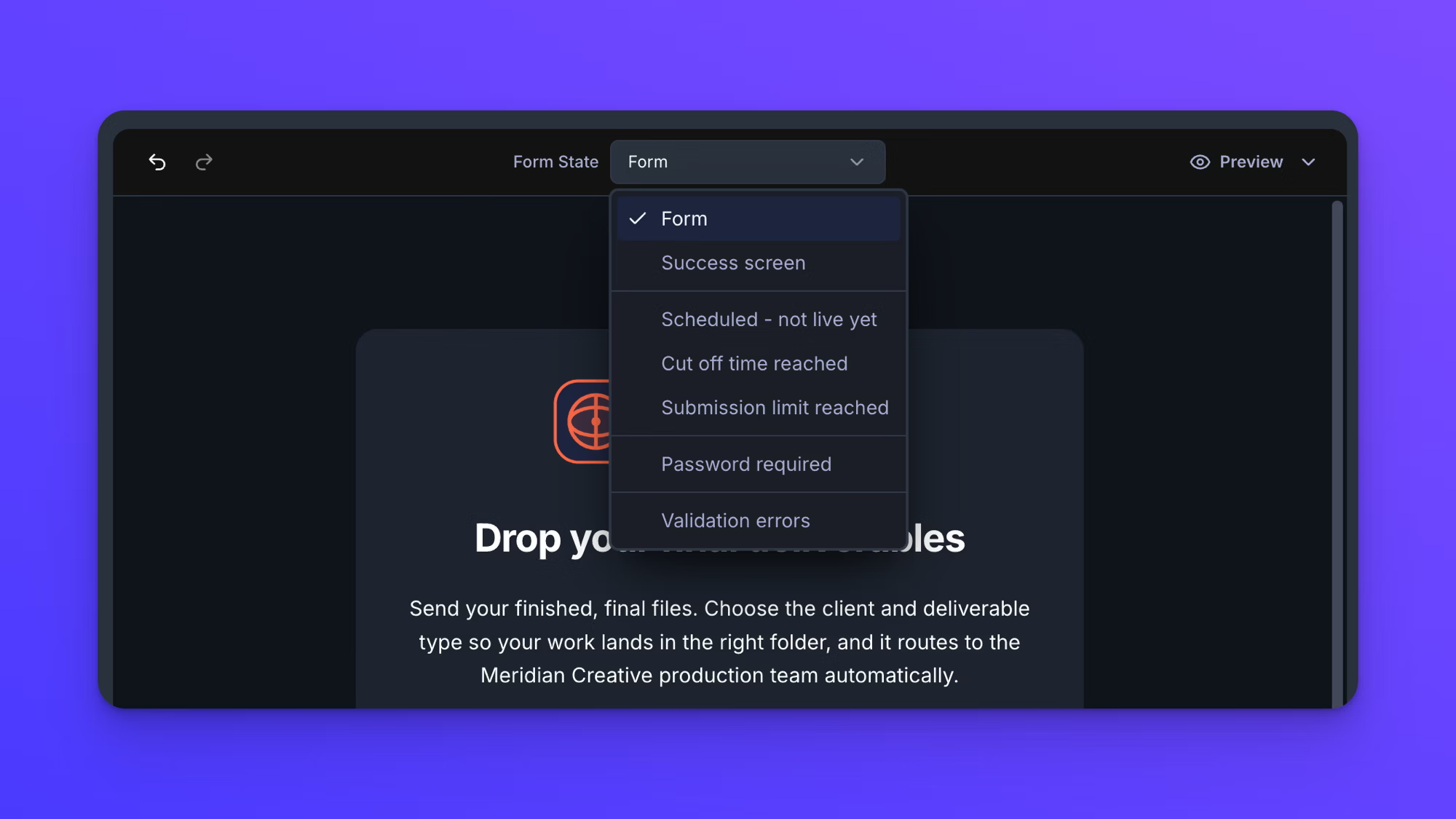
The states you can preview
- Form: the upload form as uploaders first see it.
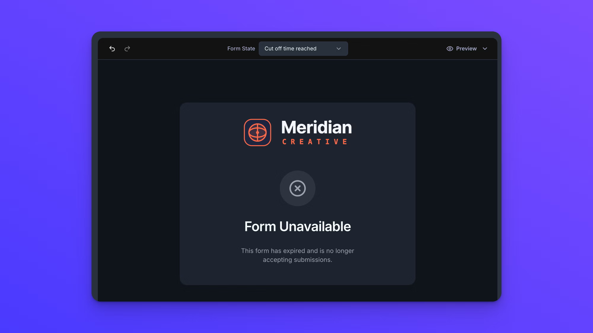
- Success screen: what uploaders see after a submission goes through, including a count of the files they sent and their total size.
- Scheduled - not live yet: a published form whose start time has not arrived yet.
- Cut off time reached: a published form that is past its cut off time.
- Submission limit reached: a published form that has taken the number of submissions it allows.
- Password required: the password prompt on a password-protected form.
- Validation errors: the form with required fields flagged and their messages shown.
Tell the closed states apart
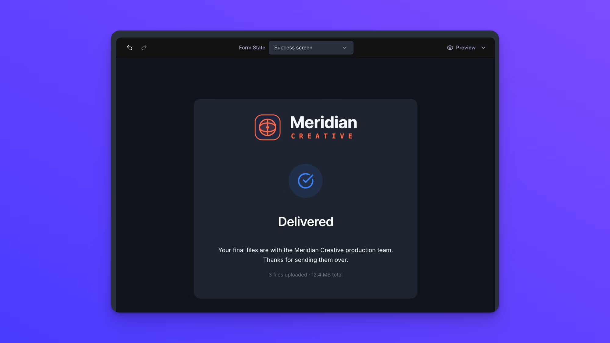
Three of the states show a form that is not open for uploads. All three are settings on a published form, so none of them means a form is in Draft.
Two of them look nearly identical. Cut off time reached and Submission limit reached both show the heading Form Unavailable and differ only in the sentence beneath it, so read that sentence to tell which one you are looking at. That sentence is yours to write, so give the two of them different wording if you want them easy to tell apart. Scheduled - not live yet shows Form Not Yet Open instead, and asks uploaders to check back later.
Style a state
Some parts of a form only exist inside a state, so the selector is also how you reach them for styling. With Style open in the left menu, switch the form canvas to a state and click any element on it. That element's settings open in Advanced Element Styling, the same way clicking an element on the form does. See Advanced form styling.
The three closed states share one set of styling. Blocked State in Advanced Element Styling covers Scheduled - not live yet, Cut off time reached, and Submission limit reached together, so styling any one of them styles all three. The icon is the only thing that differs between them, and it is set for you.
A few elements have no state of their own in the selector, Password Error State among them. Reach those from the Form element dropdown in Advanced Element Styling instead.
Change what a state says
The selector previews states. It does not edit them. That happens in two other places in the Build tab.
Form Setup holds the wording. The Success screen section is where you set Success header and Success text, which is what the Success screen state shows.
Security & Limits holds the settings that put a form into the other states: password protection, a submission limit, and the times a form opens and closes. See Password-protect a form and Schedule a form to open and close.
It also holds the wording for the three closed states. Each setting's card has a message field of its own.
- The start time card has Message shown before the form opens.
- The cut off time card has Message shown when the form has expired.
- The submission limit card has Message to display when the submission limit is reached.
Each field appears once you turn its setting on, and each has wording of its own that is used if you leave the field empty. Submission limits and the times a form opens and closes are available on the Business and Premium plans, so these three fields are too.
Behavior notes
- The Success screen state shows a file count and a total size. On the form canvas these are sample values; uploaders see the real numbers from their own submission. If your success wording uses variables, the canvas fills those with samples too, so a name reads as Alex Johnson and an email as alex@example.com.
- The Validation errors state flags every required field at once so you can see the error styling on all of them. An uploader only sees messages for the fields they actually left incomplete.
- The Form State selector goes back to Form whenever you reload the page or leave the form and come back. The state you are previewing is never saved with the form.